News and Events
Discover all the news about the Lifocolor Group
Discover all the news about the Lifocolor Group
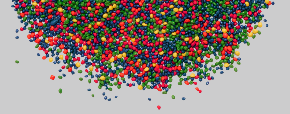
Colour is about more than just decoration. In plastic products, it also conveys brand identity and emotion before it communicates function. Based on research and practical expertise, we have compiled a list of the associations, effects and meanings of 13 fundamental colours.
Objects reflect parts of the visible light, so that the impression of colour only arises in the brain. And every person sees colours differently. Alongside hue, brightness and saturation decisively influence the emotional effect: saturated colours are perceived as more arousing than pale ones, and light shades are associated with more positive emotions than dark ones.¹ A less saturated red seems less stimulating than a strongly saturated light green.
For plastic design is saturation, which can be influenced for example through wall thicknesses and opaque, transparent or translucent colour settings, along with brightness, are independent and important control parameters of product design.
Colour associations are sometimes also universal: in an international study with around 4,600 people from 30 countries, participants associated colours with the same emotions in about 90 per cent of cases. Only 40 per cent had been expected.² Whether learned or not: culturally, there are differences. Yellow, for instance, is associated with joy by 88 per cent of people in Finland, but only 6 per cent in Egypt.³
Associations include: sun, light, joy, optimism, warmth, creativity, warning.
Psychological tendencies: Yellow is often linked to a positive mood and high visibility. The strength of this perception varies markedly according to culture and environment. Bright lemon yellow feels fresh and energetic, while mustard, ochre and golden yellow appear earthier, more grown-up and traditional.
Associations include: energy, passion, danger, urgency, love, strength, sport, action.
Psychological tendencies: Red captures attention more strongly than most other colours. Infants can usually distinguish it as the first colour. In the animal world it signals power and fertility. Bright red seems dynamic and youthful, burgundy grown-up and luxurious, coral and pinkish reds softer and less confrontational.
Associations include: trust, seriousness, competence, calm, technology, reliability, spaciousness.
Psychological tendencies: Blue is consistently rated as less arousing than red. It is frequently linked to trust and stability. In many markets it is therefore the most popular colour and perhaps also the most heavily “overused”. Cyan feels digital, more dynamic and lighter; navy comes across as serious and premium; grey-blue appears more purely technical and distant.
Associations include: nature, growth, health, sustainability, freshness, safety, permission.
Psychological tendencies: Green is now often connected with recovery and natural surroundings and is established worldwide as an “all clear” signal. The direct calming effect often ascribed to it is context dependent. Bright green feels modern and dynamic, deeper forest green more serious and premium, and grey-green more technical and restrained.
Associations include: earth, wood, leather, warmth, naturalness, craftsmanship, durability.
Psychological tendencies: Brown stands for materiality and groundedness. It often feels less artificial and is regarded as more nature-connected. Beige and sand feel light, neutral and homely; mid-brown appears emotional, homely and solid; dark brown tends to feel more conservative, heavy and intense.
Associations include: creativity, individuality, spirituality, luxury, transformation, distinctiveness.
Psychological tendencies: Purple is frequently associated with creativity and exclusivity. Its emotional meaning is particularly variable across cultures: in Greece, for instance, it is more strongly associated with sadness than in many other countries. Lilac feels soft and playful, mid-purple creative and modern, dark purple dramatic and luxurious.
Associations include: warmth, energy, sociability, optimism, activity, friendliness.
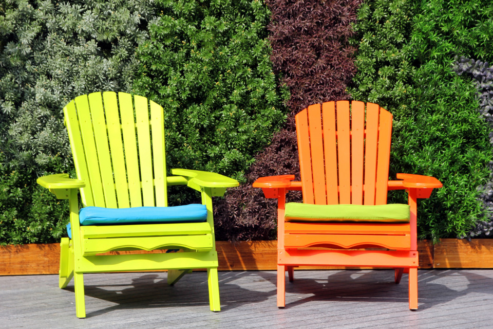
Psychological tendencies: Orange combines properties of red and yellow: energy and warmth with, among other things, high visibility and friendliness. It stands out more strongly than many yellow or brown tones, yet often appears less alarming than pure red. Bright orange feels youthful, dynamic and progressive; terracotta and rust by contrast look artisanal and grown-up; copper orange appears very approachable, warm and premium.
Associations include: tenderness, care, romance, youth, playfulness, pop culture.
Psychological tendencies: Pink in its lighter shades is often associated with softness and closeness. Pastel pink feels delicate and calm, whereas vibrant pink, due to its higher red content (see Red above), comes across as self-assured and poppy; dusty pink appears more mature and fashion-forward.
Associations include: power, authority, elegance, formality, luxury, mystery.
Psychological tendencies: Black is often connected with sovereignty and a premium aesthetic. Large surfaces, however, can feel heavy, sombre, lifeless or unapproachable. The combination with other colours changes the impression considerably. Deep black feels powerful and formal, anthracite more technical and at times softer, and black with metallic or textured effects appears material and premium.
Associations include: purity, cleanliness, order, simplicity, openness, emptiness.
Psychological tendencies: White is often associated with clarity and hygiene, though too much white can feel very sterile or empty. Culturally, white is ambivalent: in Western contexts it is linked to weddings, in parts of East Asia also to mourning. Pure white feels technical, clean, clinical; cream white appears homelier and friendlier; off-white looks subtle and premium.
Associations include: neutrality, matter-of-factness, professionalism, technology, balance.
Psychological tendencies: Grey is read as a technical, professional backdrop, though without livelier colours it can also be associated with boredom or distance. Light grey feels light and modern, anthracite serious and premium, warm greys with a brown or beige undertone homelier, and cool grey with a blue undertone even more technical.
Associations include: value, success, prestige, ceremony, exclusivity, luxury.
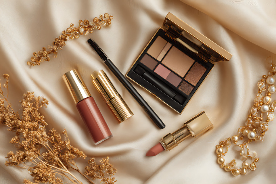
Psychological tendencies: Gold is closely linked to material preciousness and historic status. Research on luxury product perception shows gold, alongside silver and metallic black, as one of the dominant associations with premium quality.⁴ Yellow gold feels classic, rose gold modern and warm, antique gold cultivated and restrained.
Associations include: technology, precision, coolness, cleanliness, modernity, future.
Psychological tendencies: Silver is frequently linked to technical quality, purity and objectivity. For electronics and automotive contexts it is among the colours most strongly associated with premium and modernity.⁴ High-gloss silver feels futuristic, brushed silver functional and industrial, grey silver more neutral and less metallic.
Several factors come together when choosing colours for plastics: a clear (brand and product) positioning with a focus on the target buyer group comes before the colour choice. Hue, brightness and saturation should on the one hand support the concept but also be considered together with material, surface and light as integral parts of the colour effect.
Anyone who brings these levels together makes active decisions that can position product design as a competitive advantage.
Subjectivity and (emotional) intuition often also play a part in the choice, given people’s different individual colour perceptions, imprints and experiences: and, as the saying goes, there is no accounting for taste.
Looking for the Right Colour for Your Plastic Product?
Get in touch with our customer service team. We advise you on colour selection and on effect and additive masterbatches for your application.
Contact:
Phone: +49 (0) 9571 789-0
Further Links and Information:
Lifocolor │ Why people perceive colours differently
Lifocolor │ The impact of colour on consumer behaviour
Lifocolor │ Trend service and Shades of Inspiration
1 Wilms, L., & Oberfeld, D. (2018). Color and emotion: Effects of hue, saturation, and brightness. Psychological Research, 82, 896–914.
2 Jonauskaite, D., et al. (2020). Universal patterns in color-emotion associations are further shaped by linguistic and geographic proximity. Psychological Science, 31(10), 1245–1260.
3 Jonauskaite, D., et al. (2019). The sun is no fun without rain: Physical environments affect how we feel about yellow across 55 countries. Journal of Environmental Psychology, 66.
4 Ibarra Gutiérrez, L. E., Rosales Cinco, R. A., & Prado León, L. R. (2017). Color Preference in Luxury Electrical Appliances. Universal Journal of Psychology, 5(4), 173–178.
Primary Academic Sources
Megbel, E. (2023). Die Macht der Farben [The Power of Colours]. Gehirn&Geist, 7/2023, pp. 12–19.
Luerweg, F. (2023). Im Auge des Betrachters [In the Eye of the Beholder]. Gehirn&Geist, 7/2023, pp. 22–27.
Spektrum der Wissenschaft KOMPAKT 35.23: Farben – Wahrnehmung und Einfluss [Colours – Perception and Influence]. 2023.‘
Elliot, A. J., & Maier, M. A. (2014). Color psychology: Effects of perceiving color on psychological functioning in humans. Annual Review of Psychology, 65, 95–120.
Hauck, P., et al. (2022). Crossmodal correspondence between music and ambient color is mediated by emotion. Multisensory Research, 35.
Ibarra Gutiérrez, L. E., Rosales Cinco, R. A., & Prado León, L. R. (2017). Color Preference in Luxury Electrical Appliances. Universal Journal of Psychology, 5(4), 173–178.
Jonauskaite, D., et al. (2019). The sun is no fun without rain: Physical environments affect how we feel about yellow across 55 countries. Journal of Environmental Psychology, 66.
Jonauskaite, D., et al. (2020). Universal patterns in color-emotion associations are further shaped by linguistic and geographic proximity. Psychological Science, 31(10), 1245–1260.
Jonauskaite, D., & Mohr, C. (2025). Do we feel colours? A systematic review of 128 years of psychological research linking colours and emotions. Psychonomic Bulletin & Review, 32(4), 1457–1486.
Wilms, L., & Oberfeld, D. (2018). Color and emotion: Effects of hue, saturation, and brightness. Psychological Research, 82, 896–914.